Pie chart for Wealth Overview on Client Portal
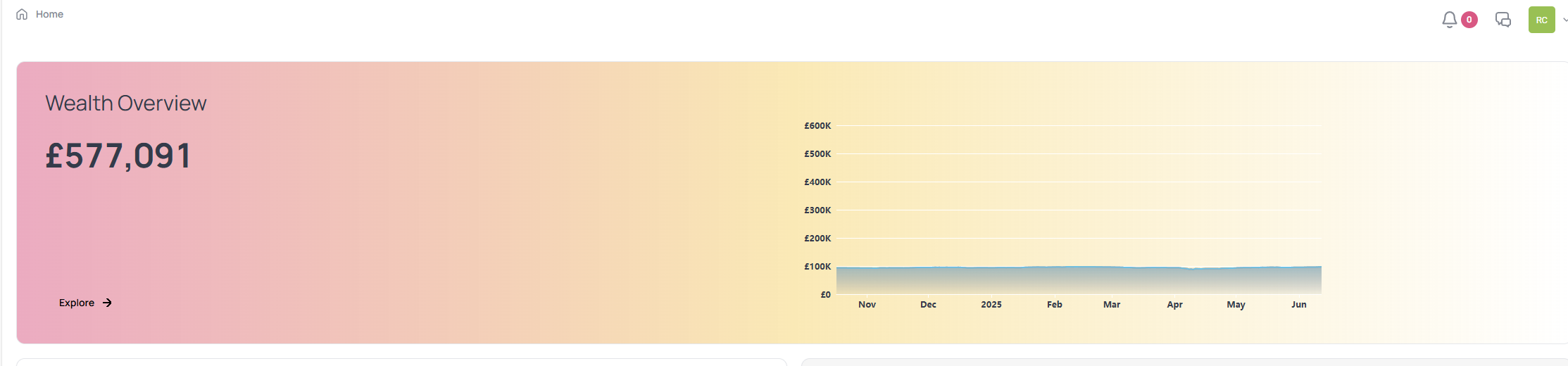
I’d suggest on the client portal with the Wealth Overview, there should be a pie chart showing the breakdown of the ‘Wealth’ - e.g. property, investments, pensions etc. so it’s a quick snapshot to show where the wealth figure comes from and clients can click through via each slice to ‘explore’ further.
As it stands now, it’s not obvious to clients and there is only a small button to ‘explore’.
A recent client feedback of the Client Portal was that he thought the wealth figure stated was a typo of his investment value as he didn’t realise this was ‘wealth’ (Net worth) and didn’t realise he can click through the ‘explore’ button.
Please authenticate to join the conversation.
Accepting Feedback
Feature Request
About 1 year ago

Ricky Chan
Subscribe to post
Get notified by email when there are changes.
Accepting Feedback
Feature Request
About 1 year ago
Ricky Chan
Subscribe to post
Get notified by email when there are changes.